About Me
Welcome, my name is Nathan Clarke and I am a Graphic Designer. My passion lies in creating visually compelling designs that communicate effectively. I admire the conceptual side of Graphic design and create things with intent and emotion behind them. Whether it be branding, typography, posters, book covers, or packaging, the emotional aspect behind each design captivates me and drives my creative process.
Graphic Design Work
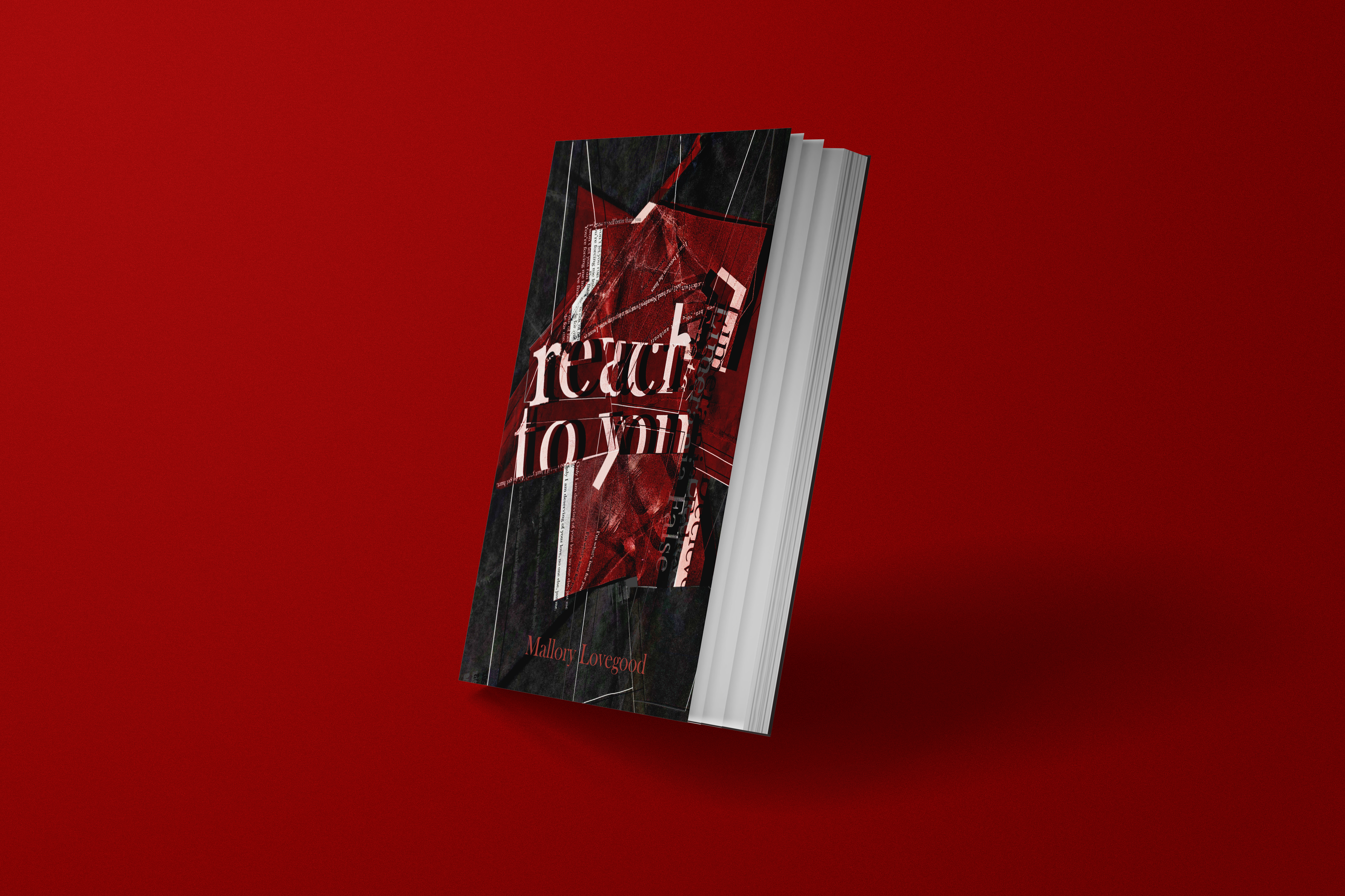
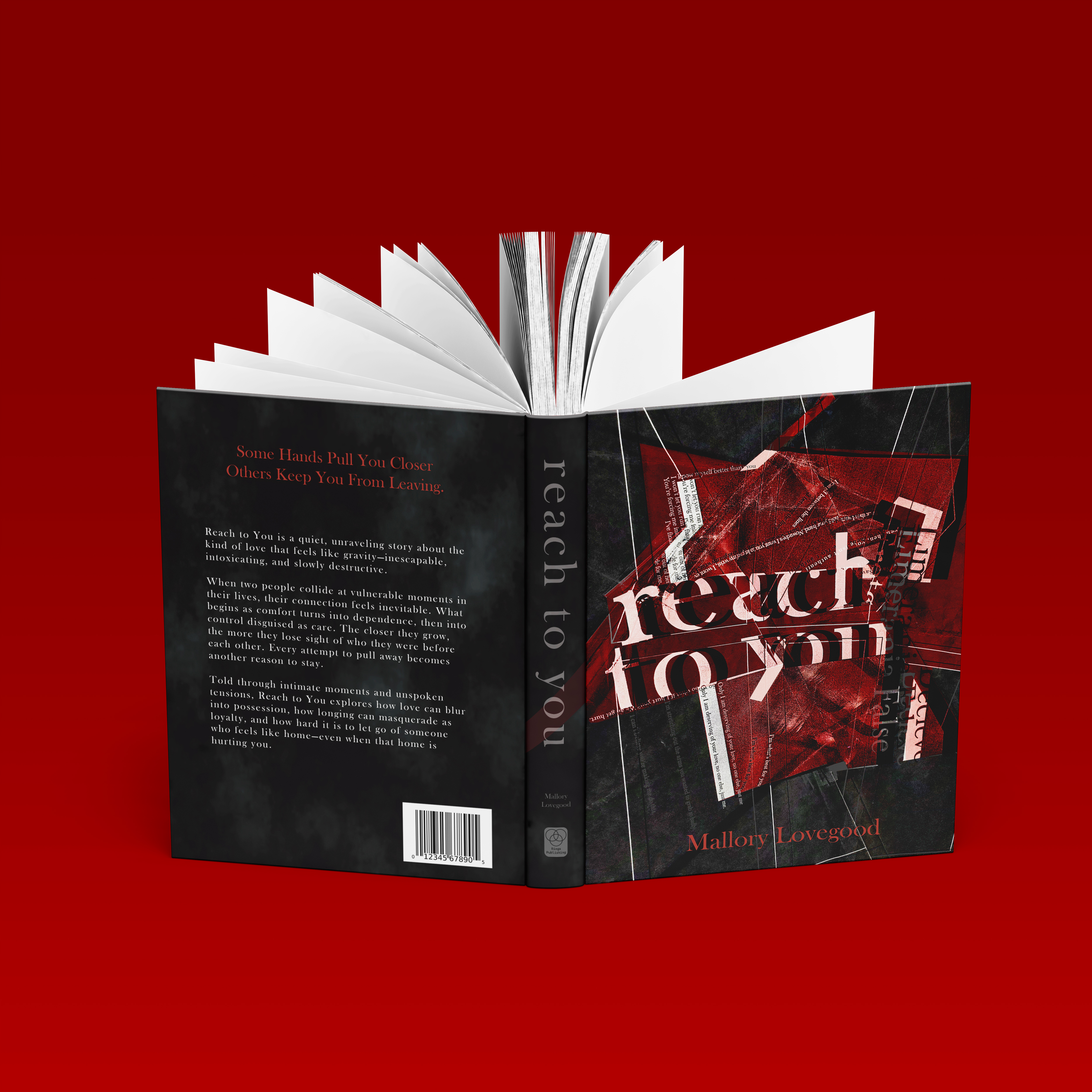
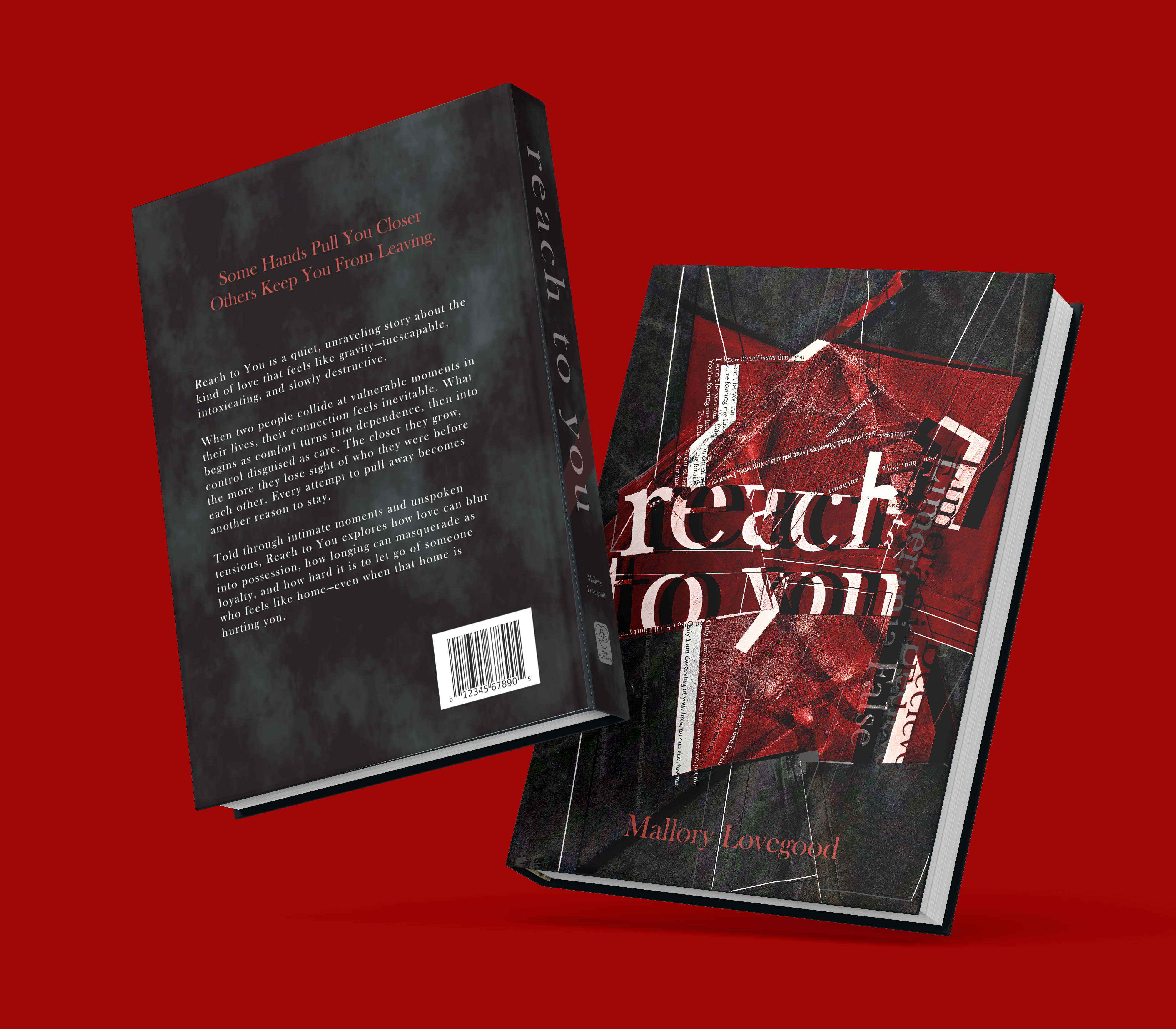
Reach To You
Size: 8 x 10 inches
Reach to You is a suspenseful book about lost connection. This book's cover uses a near-black palette- and compressed composition to convey density. Instead of relying on large areas of negative space, the darkness becomes the unifying field. Fragmented and skewed typography surrounding the composition to destabilize the visual language of “love.” The Reach to You text remains the only clearly legible anchor. This contrast in readability establishes hierarchy and directs the eye with intention. The reaching hand functions as both focal point and directional cue, its gesture cutting through the dark field to suggest connection without resolution. The overall design communicates tension through imbalance, controlled legibility, and visual weight rather than overt symbolism.
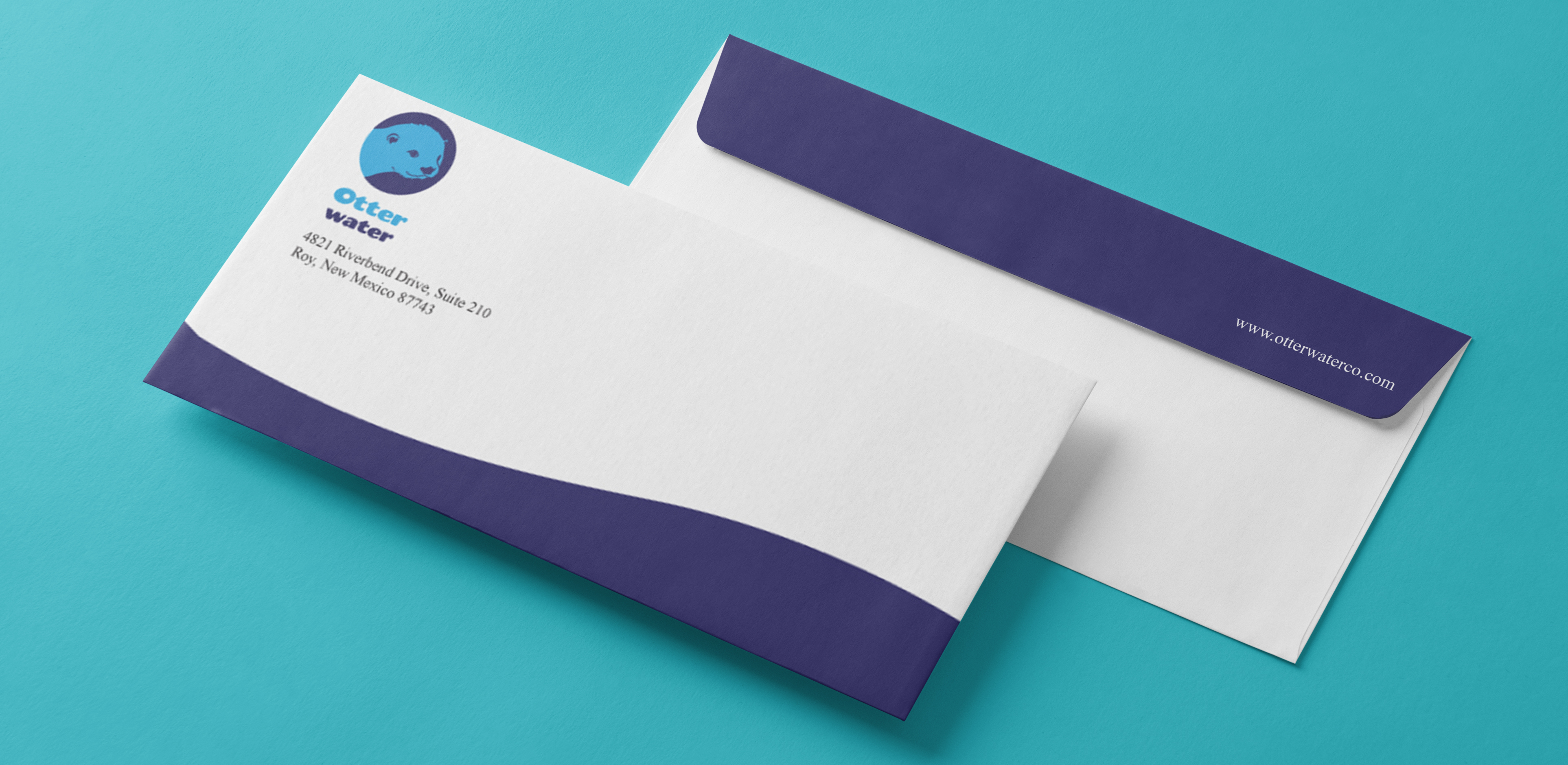
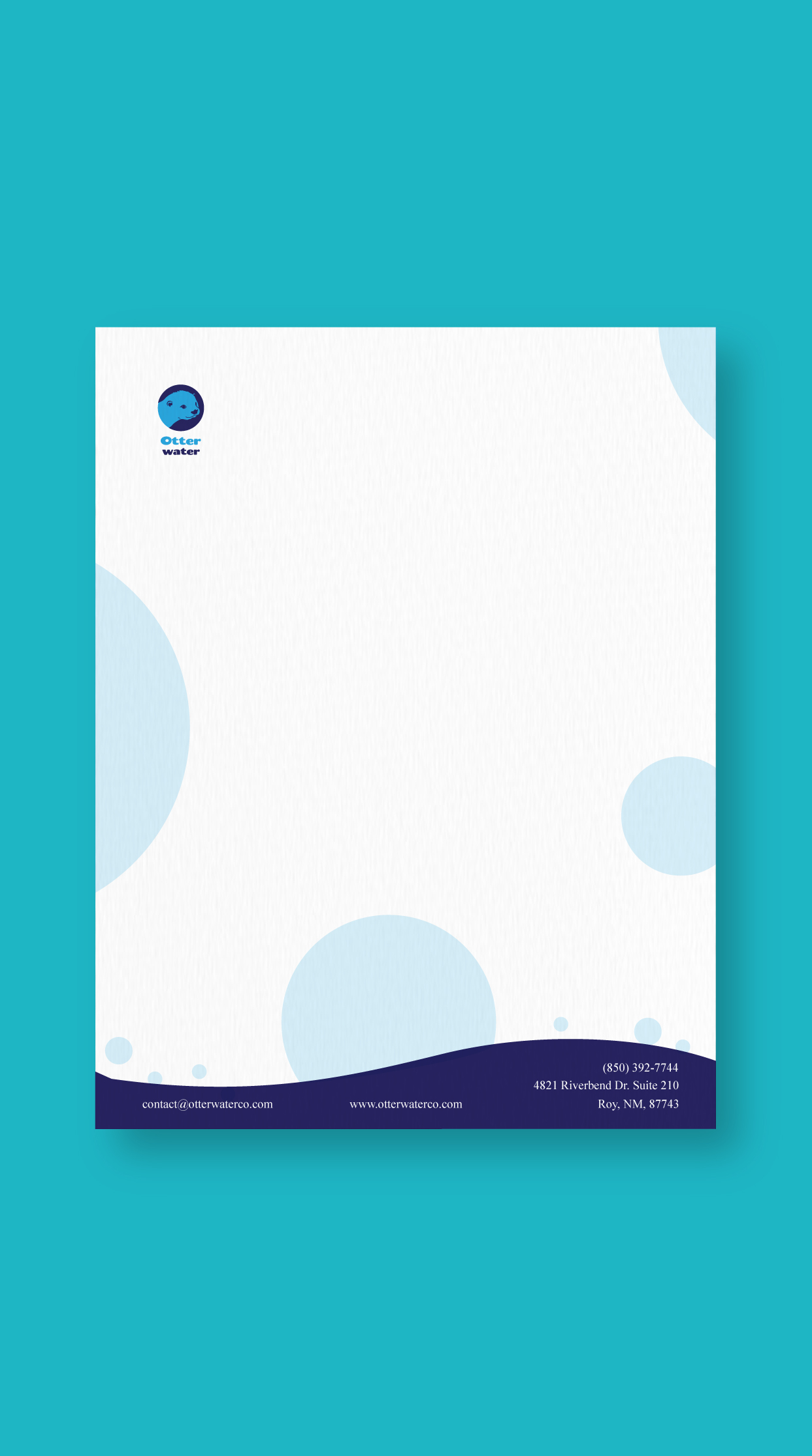
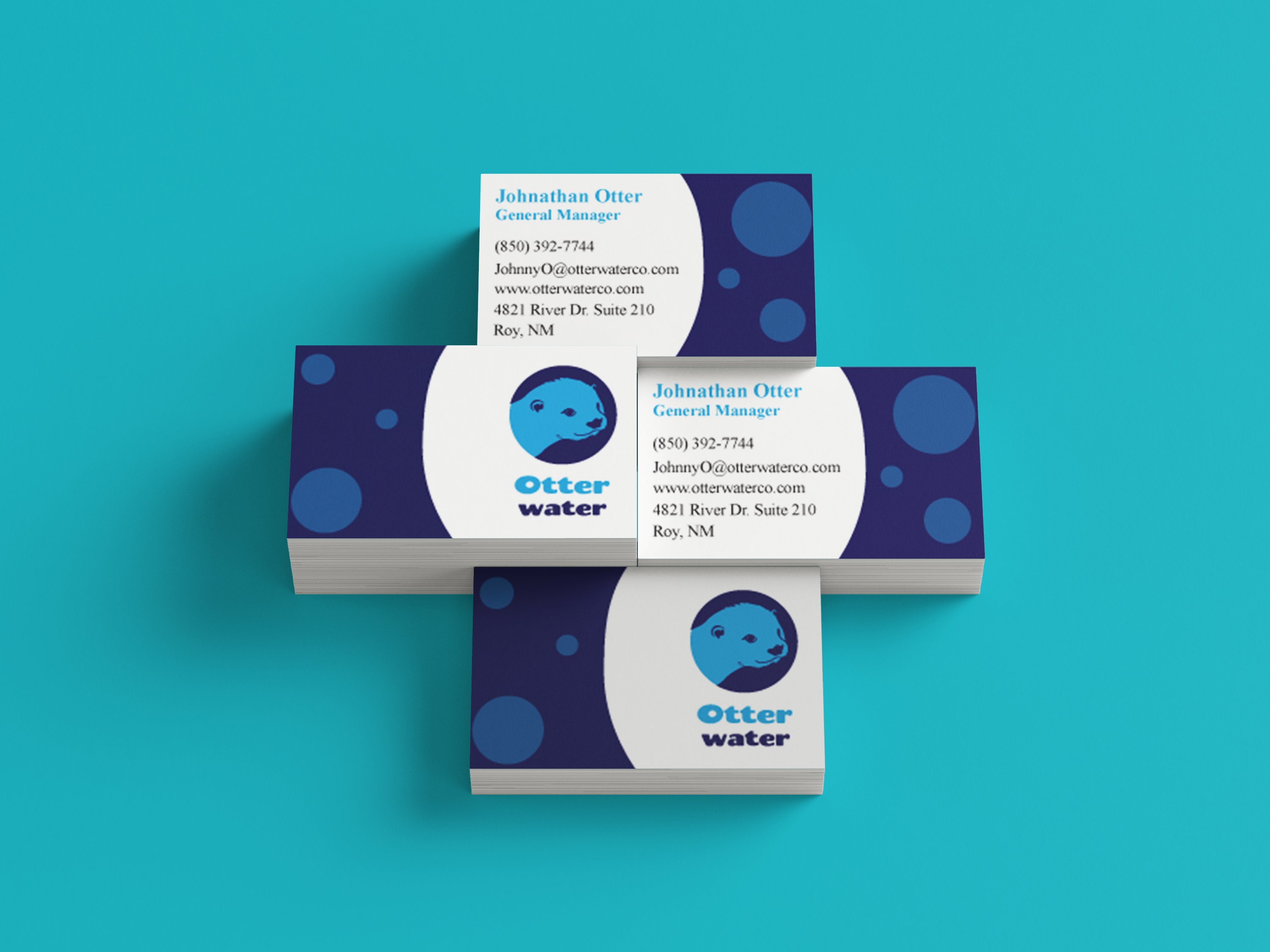
Otter Water
Size: Standard sizes
Built around the otter mark, this stationery uses soft blues and floating bubble secondary elements to create a sense of calm and movement while conveying the water park company.
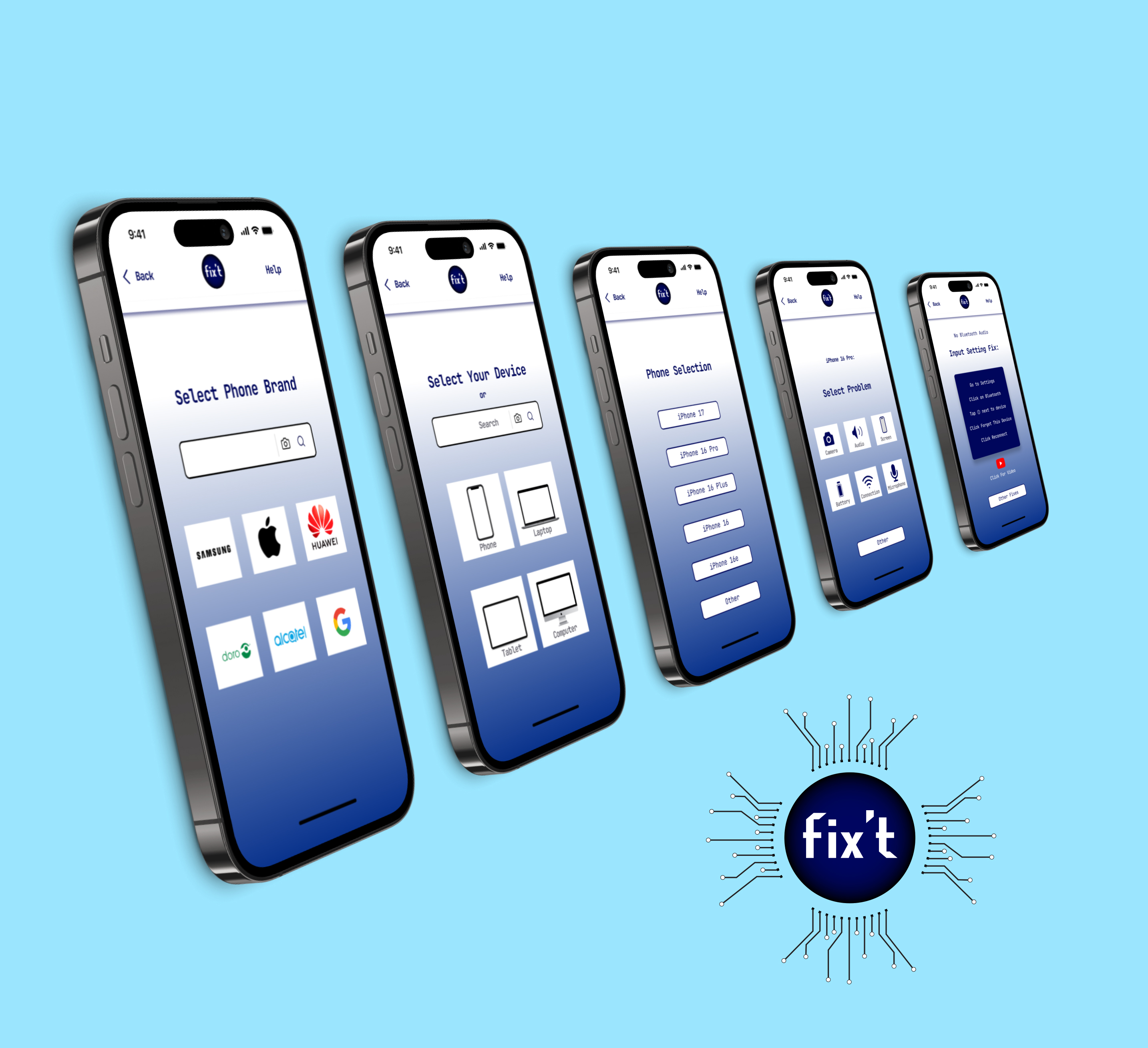
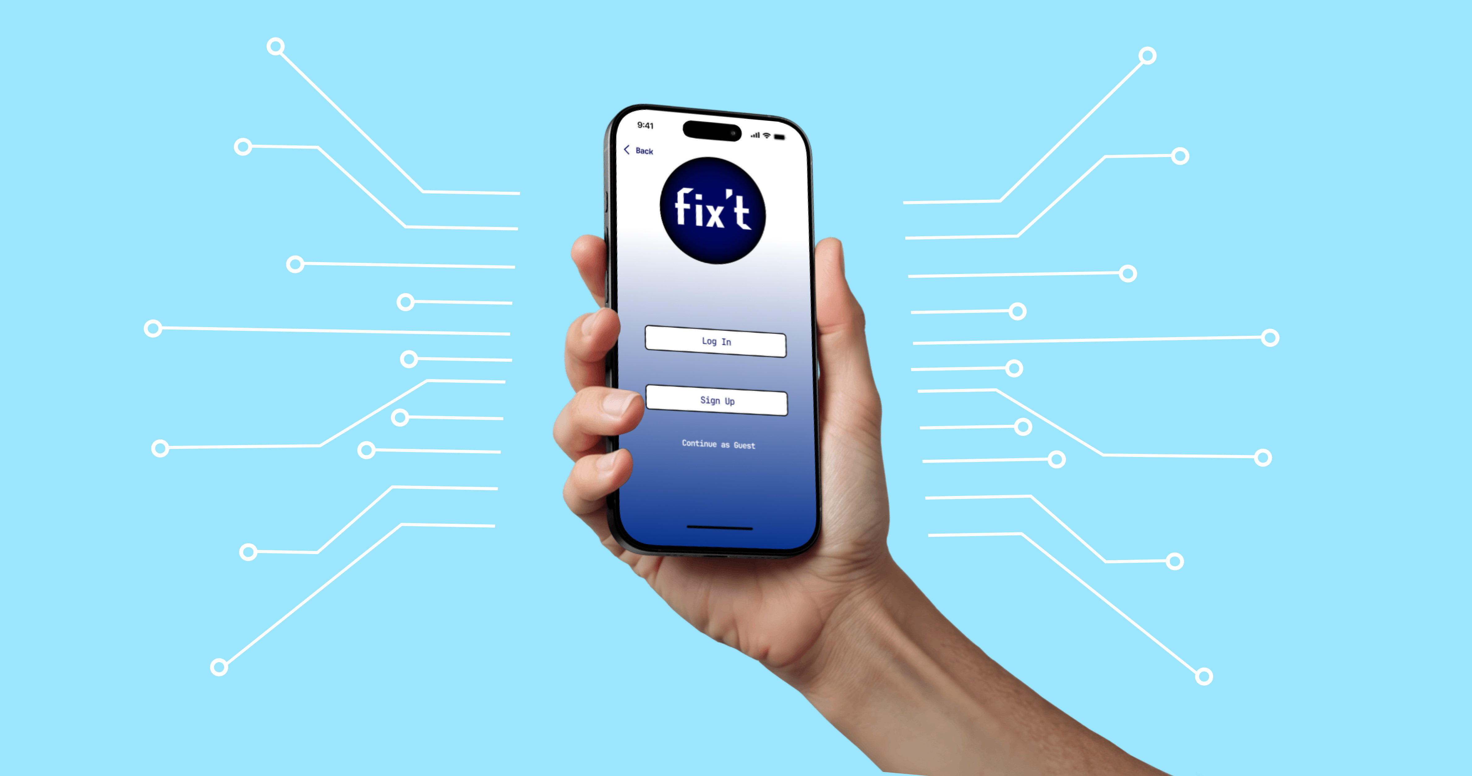
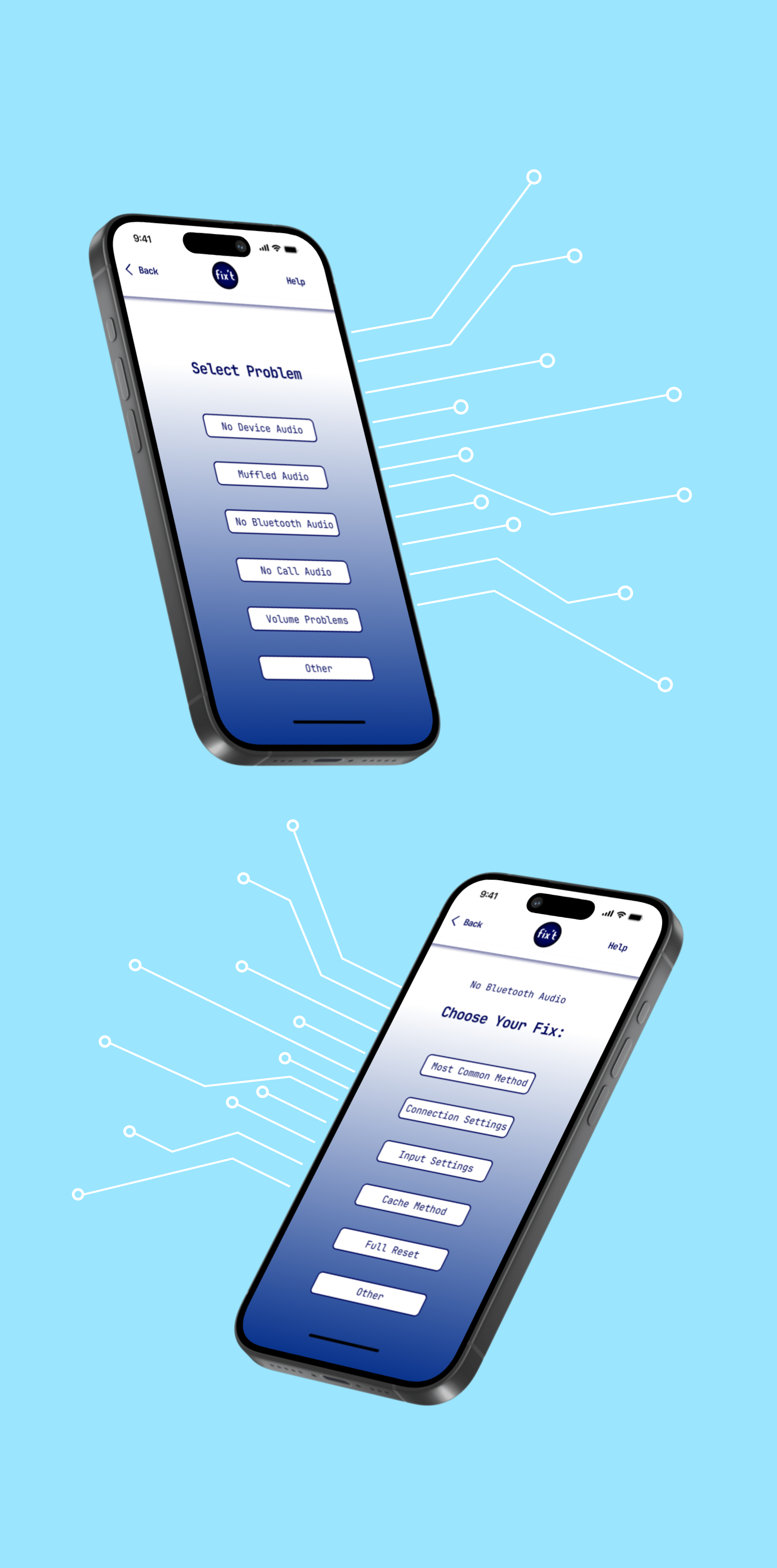
Fix't App
Size: iPhone 16 Pro Screens
The Fix't application is designed with for simplified repair instructions for what is normally a high-stress situation. The high-clarity minimalist design is anchored by a singular, professional blue that evokes technical reliability. A soft gradient transitioning from clean white to the brand’s signature blue serves as a visual metaphor for the repair process—moving from the blank state of a broken device toward a functional, blue-sky solution. The interface prioritizes a calm user experience by stripping extra elements to provide instructions that are seamless.
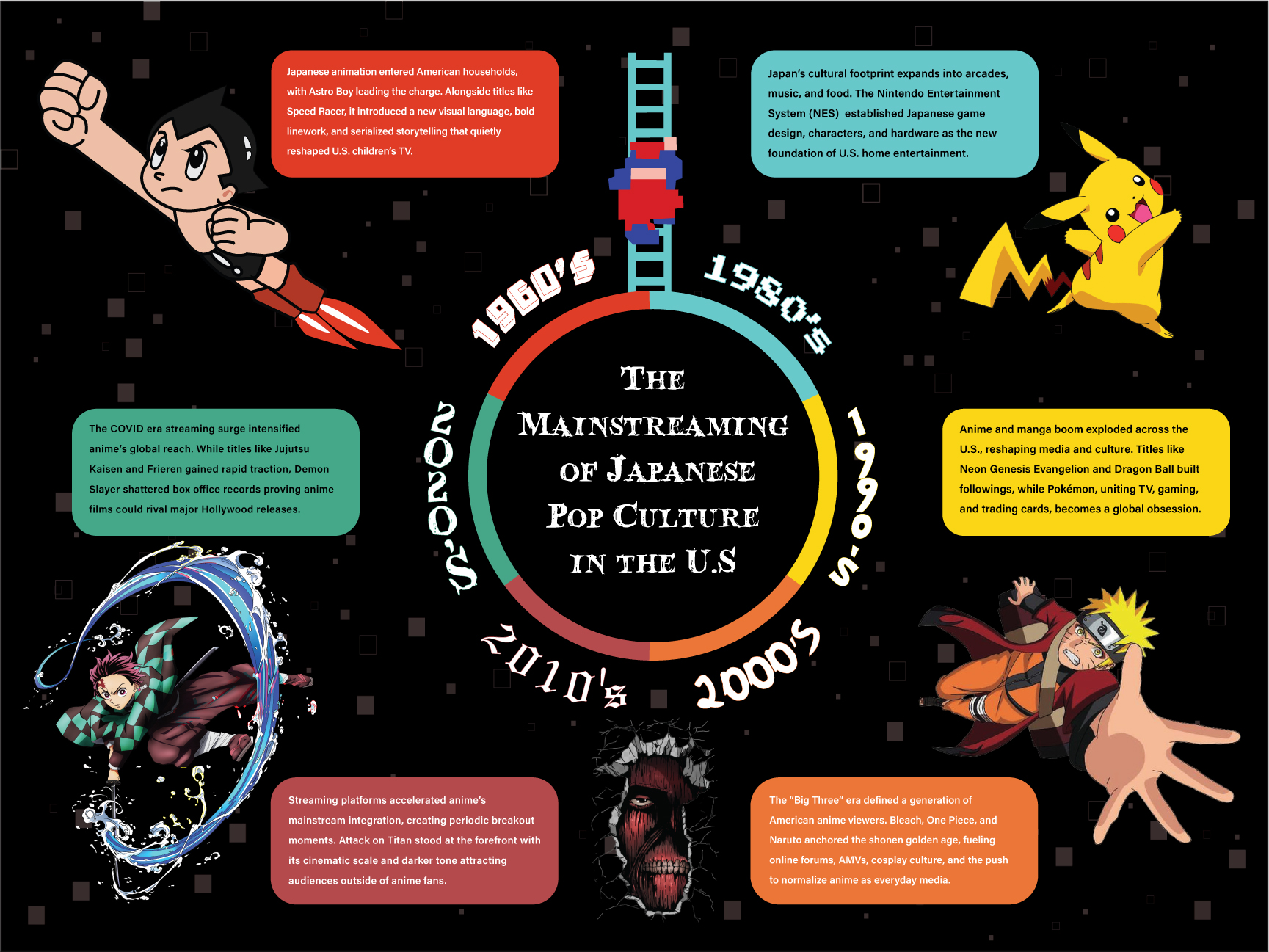
The Mainstreaming of Japanese Pop Culture in the USA
Size: 18 x 24 inches
This poster presents a six-decade timeline of the influence of Japanese media on American culture. The composition is structured in a clockwise progression around the composition. Full-color characters emerge from each corner including Astro Boy ascending, Mario climbing his ladder, Pikachu energized, Naruto in motion, a Titan breaking through the wall, and Tanjiro cutting forward. These serve as both visual anchors and directional guides. Each era is set in a typeface drawn from its associated series, with headers color-matched to their corresponding text boxes to reinforce hierarchy and cohesion. Against a black field, contrast, movement, and corner tension unify the composition into a continuous generational narrative.
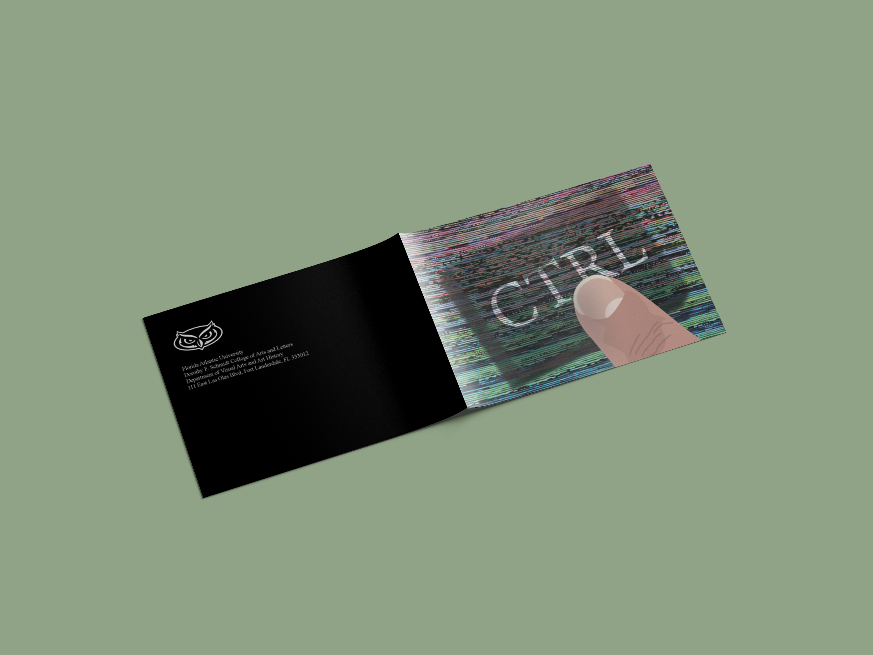
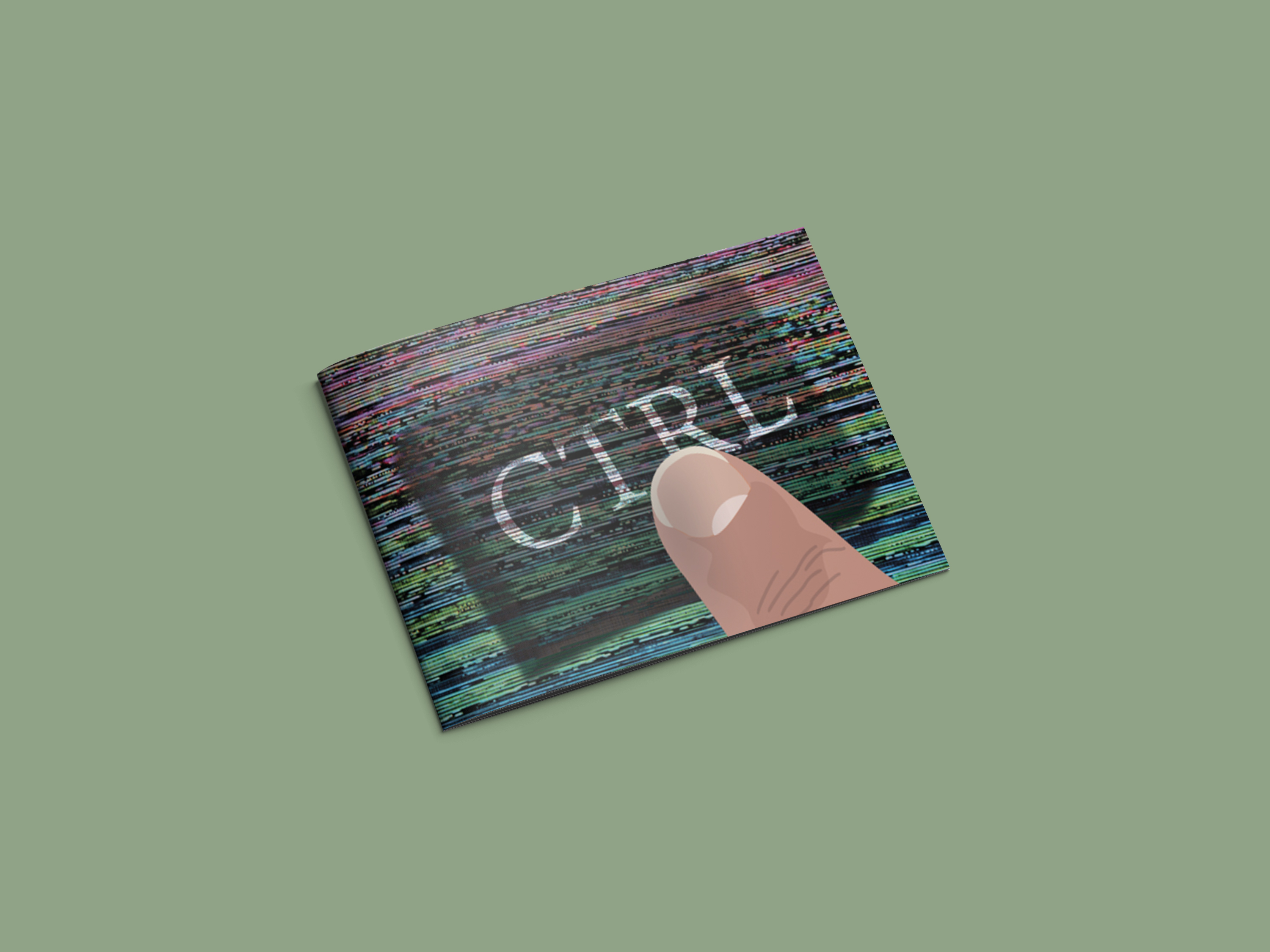
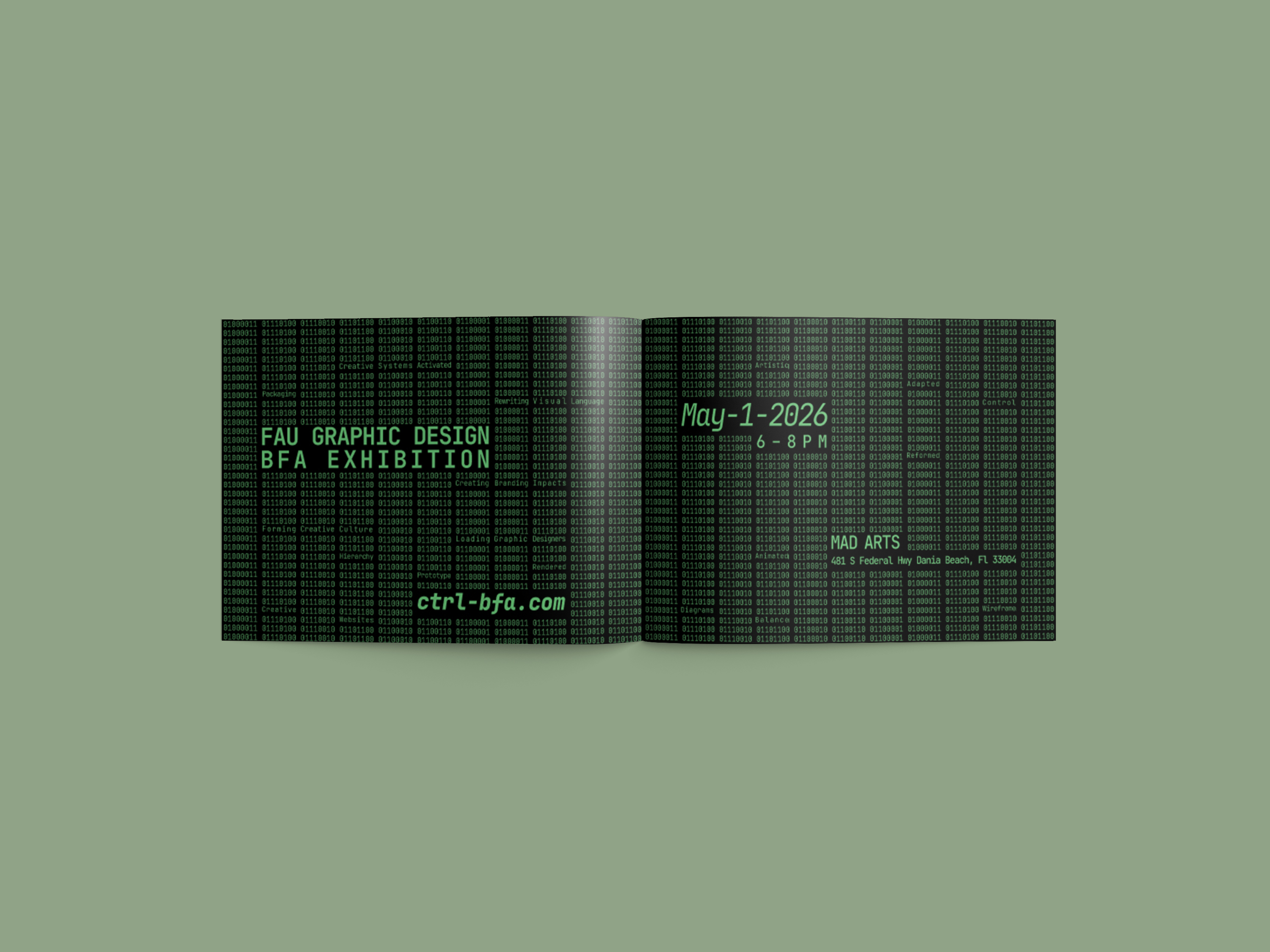
Ctrl Invitation
Size: 5 x 7 inch folded size
A self-mailer invitation showcasing a Graphic Design BFA show targeting professional designers. The colorful outside features a finger pressing the ctrl key as a direct interpretation of the CTRL theme. The interior features code visuals that repeat the binary text for ctrl. Color and type reference early CRTL monitors. Hidden words are in the code which makes the invite interactive by providing the viewer with a reward of discovery.
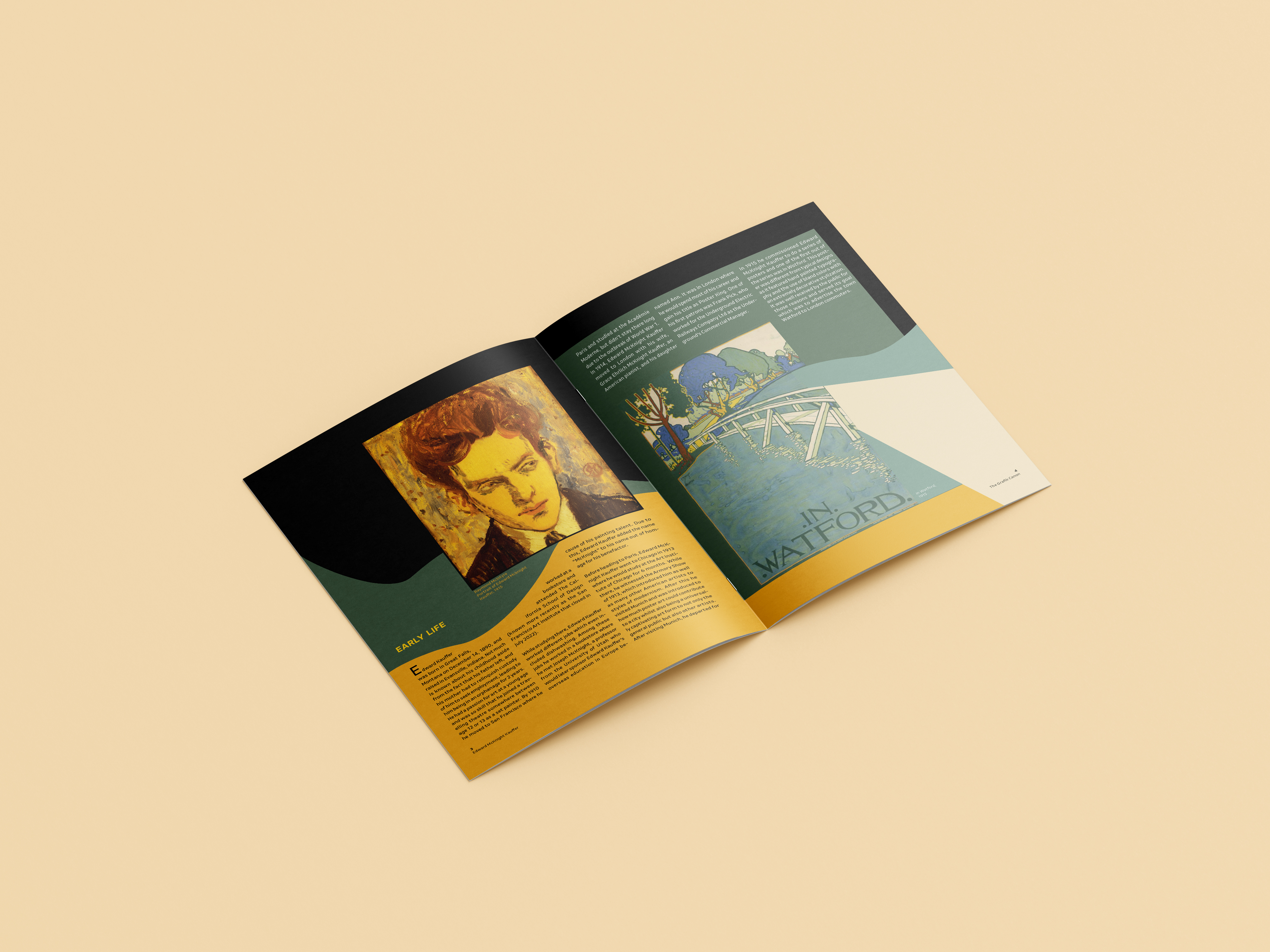
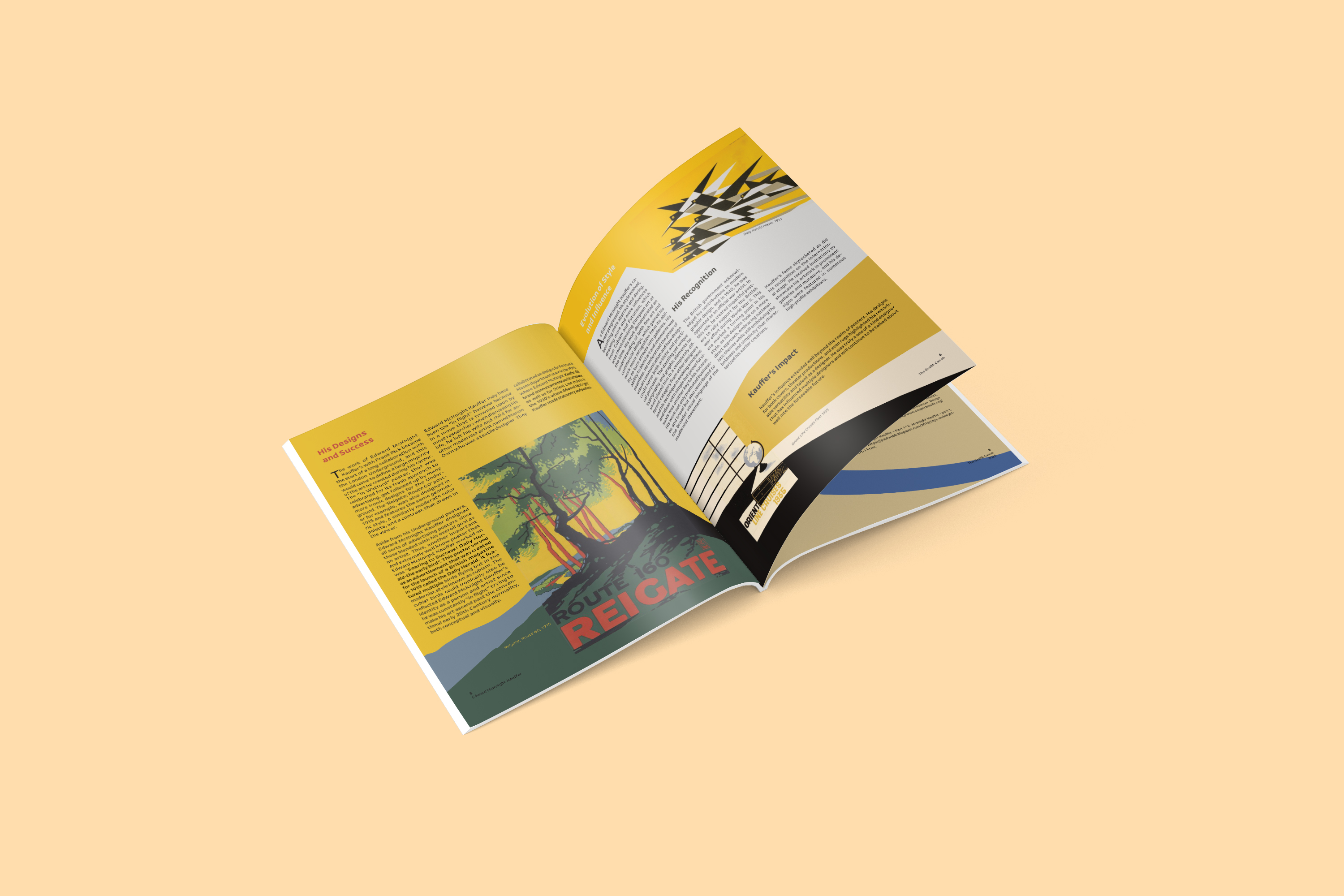
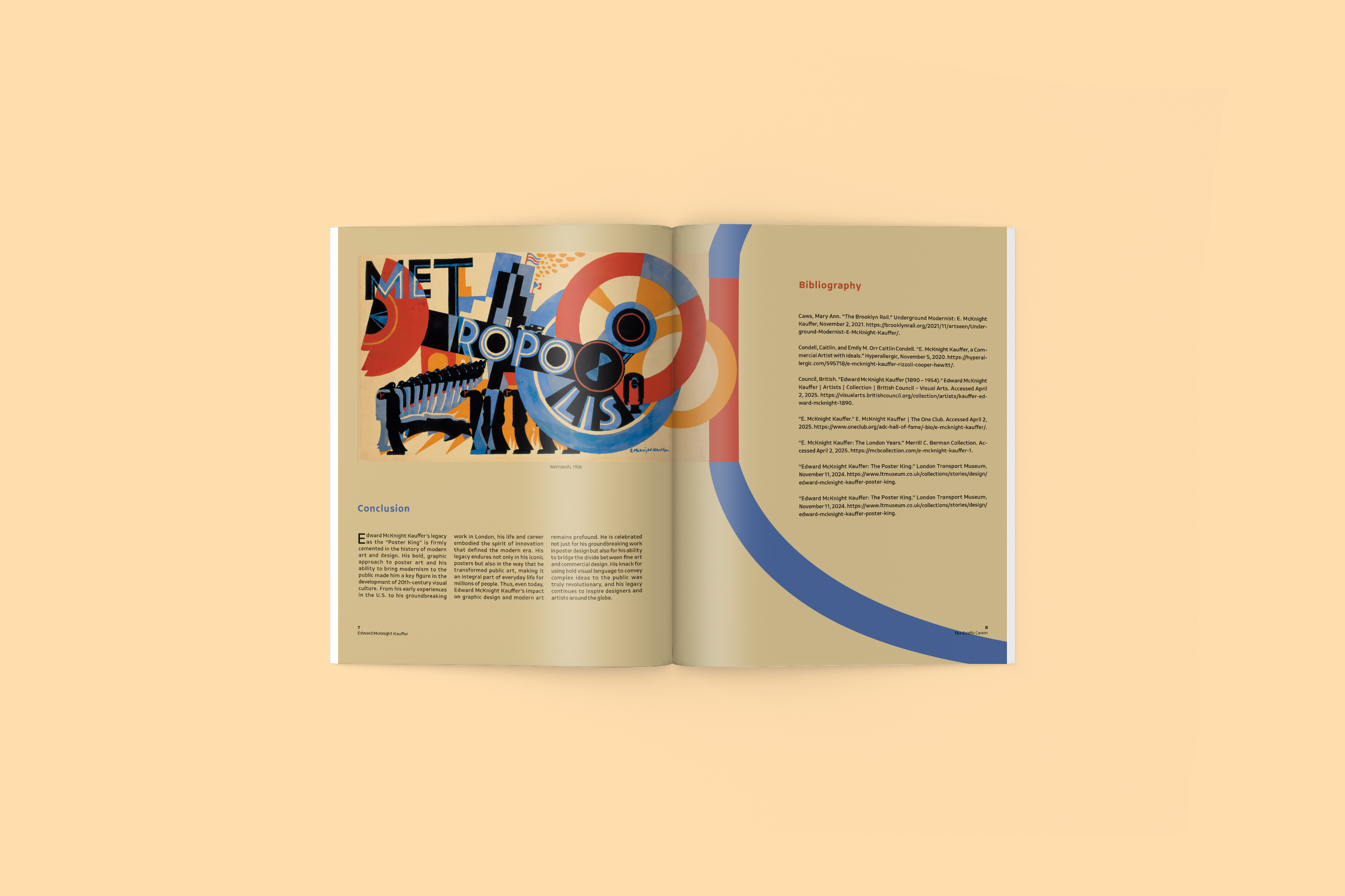
Edward Mcknight Kauffer Magazine Spreads
Size: 8.5 x 11 inch 8 pages
Edward McKnight Kauffer is an important figure in the history of Graphic Design. These magazine spreads feature a biography and the visuals of designer Edward McKnight Kauffer, the poster king. A few of his most visually appealing works are highlighted and inspire additional elements to create a dynamic composition that embodies the spirit of his work.
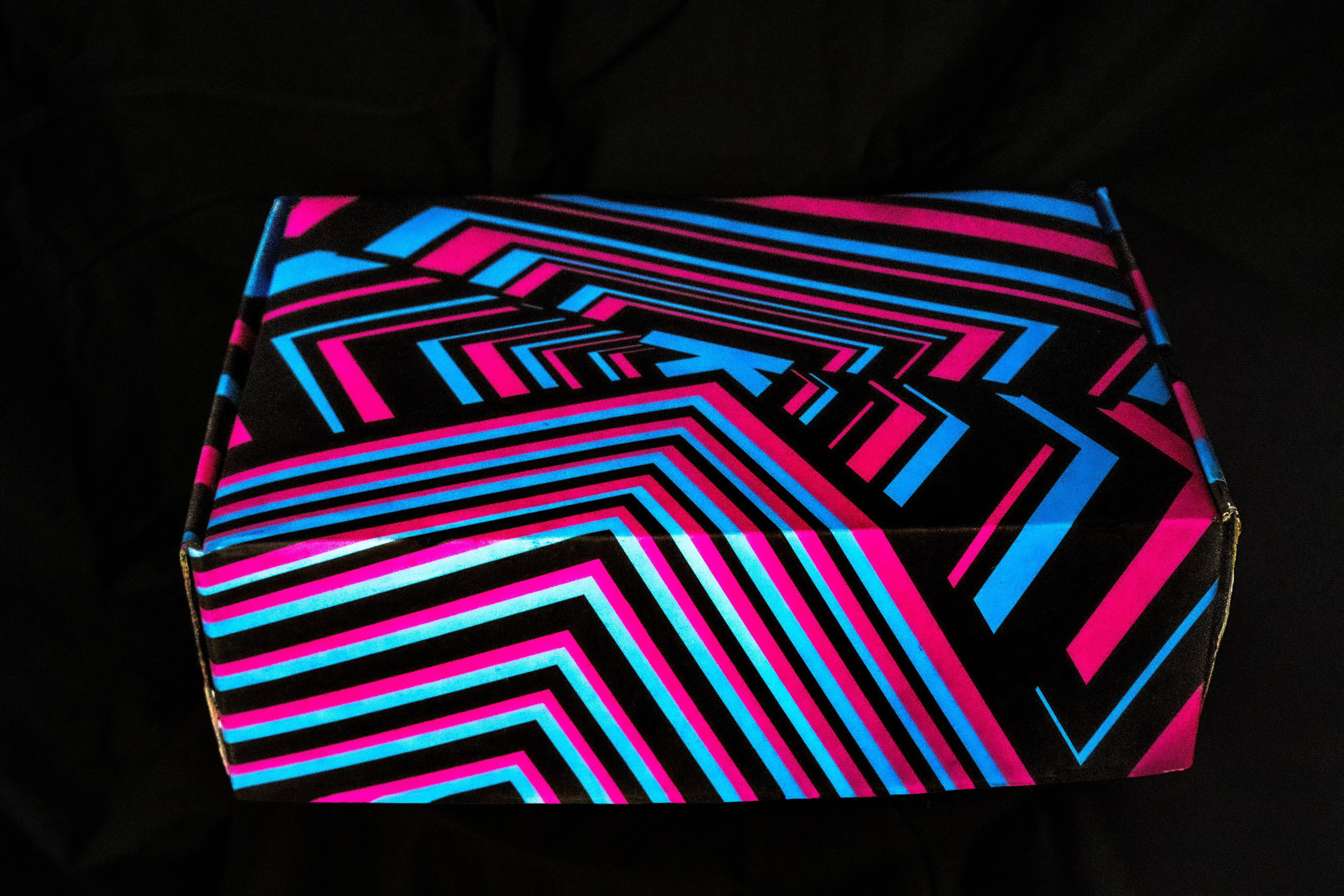
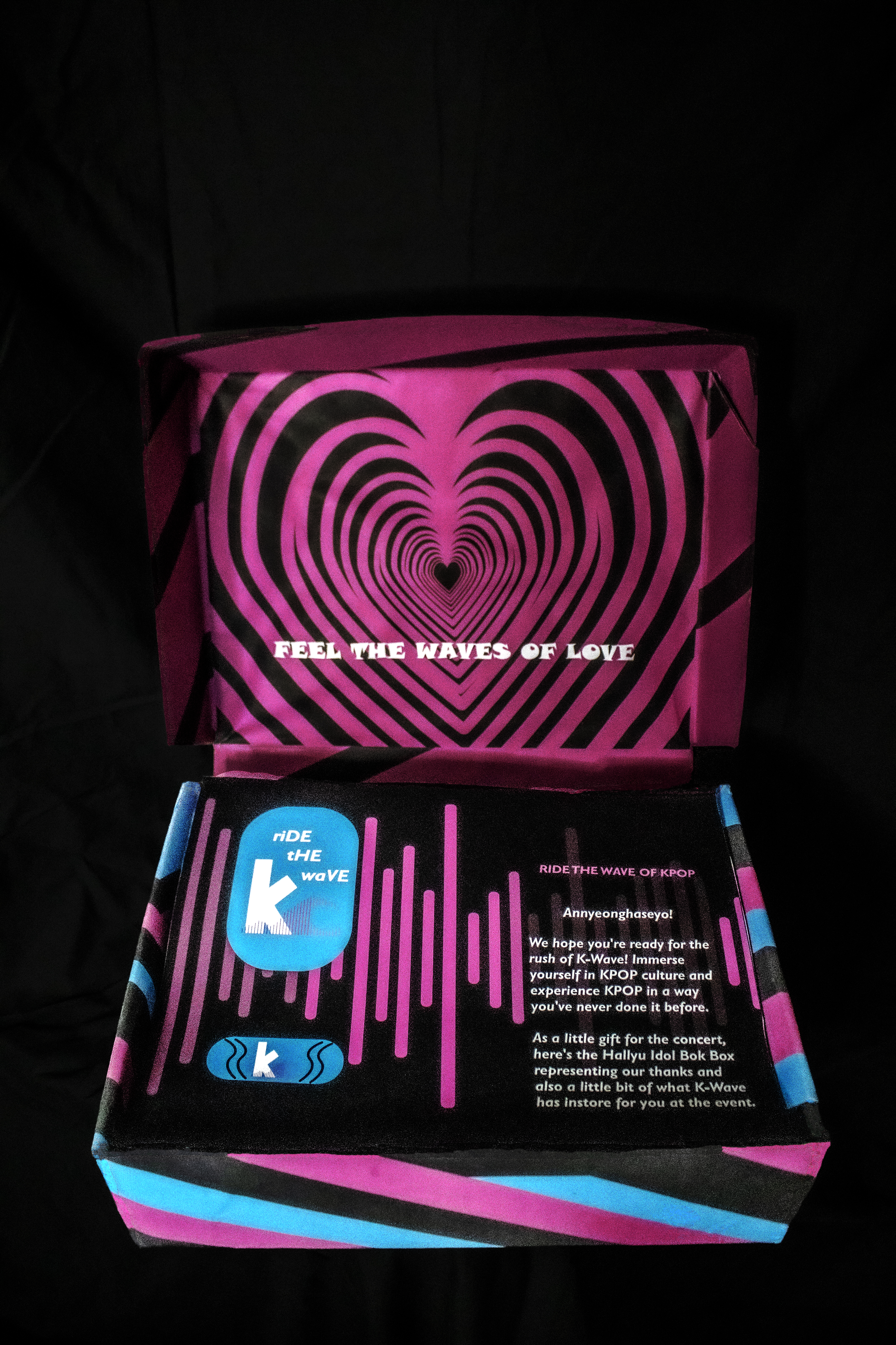
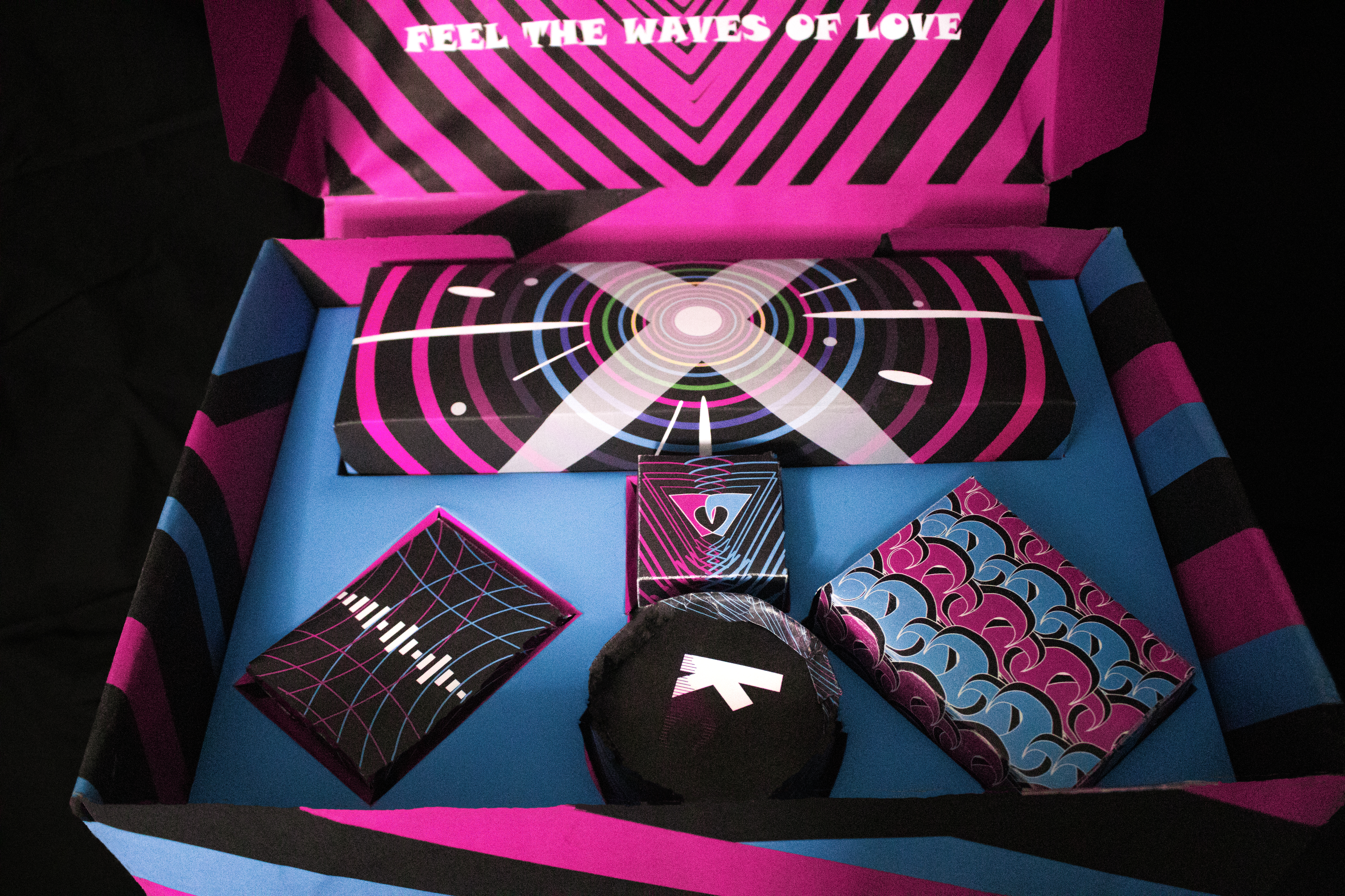
K-WAVE Merch Box
Size: 10 x 13 x 4 inches
K-Wave is an event for K-Pop fans who love the genre and the atmosphere that comes from being surrounded by like-minded fans. The vibrant colors represent the flashy and stand out style and colors, and the motion and movement represent the high energy of fast paced music and explosive dances. There are also different variations of waves to represent the theme of waves crossing multiple interpretations. The visuals embody the refined but cute and energetic style of Korean Pop music.
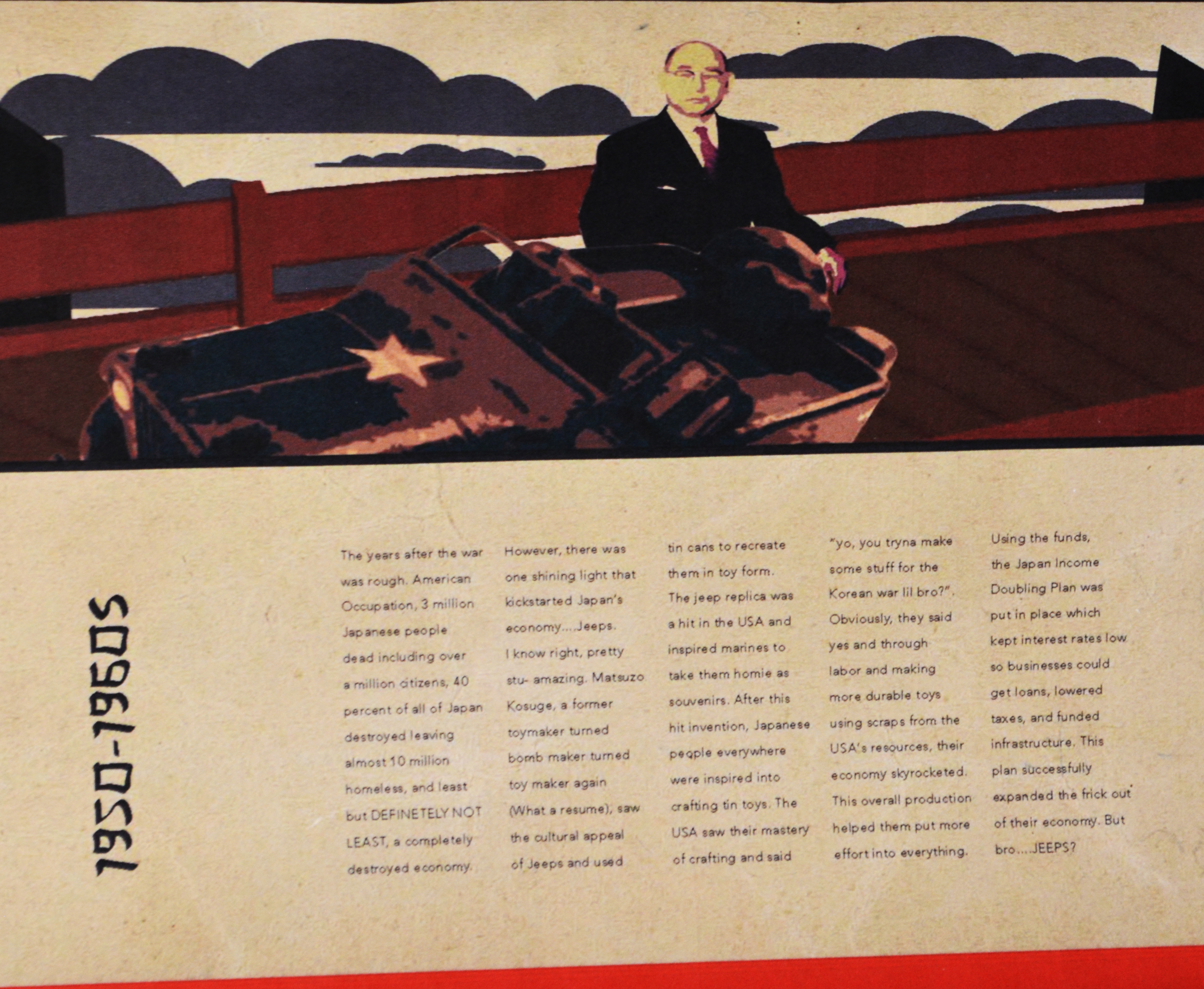
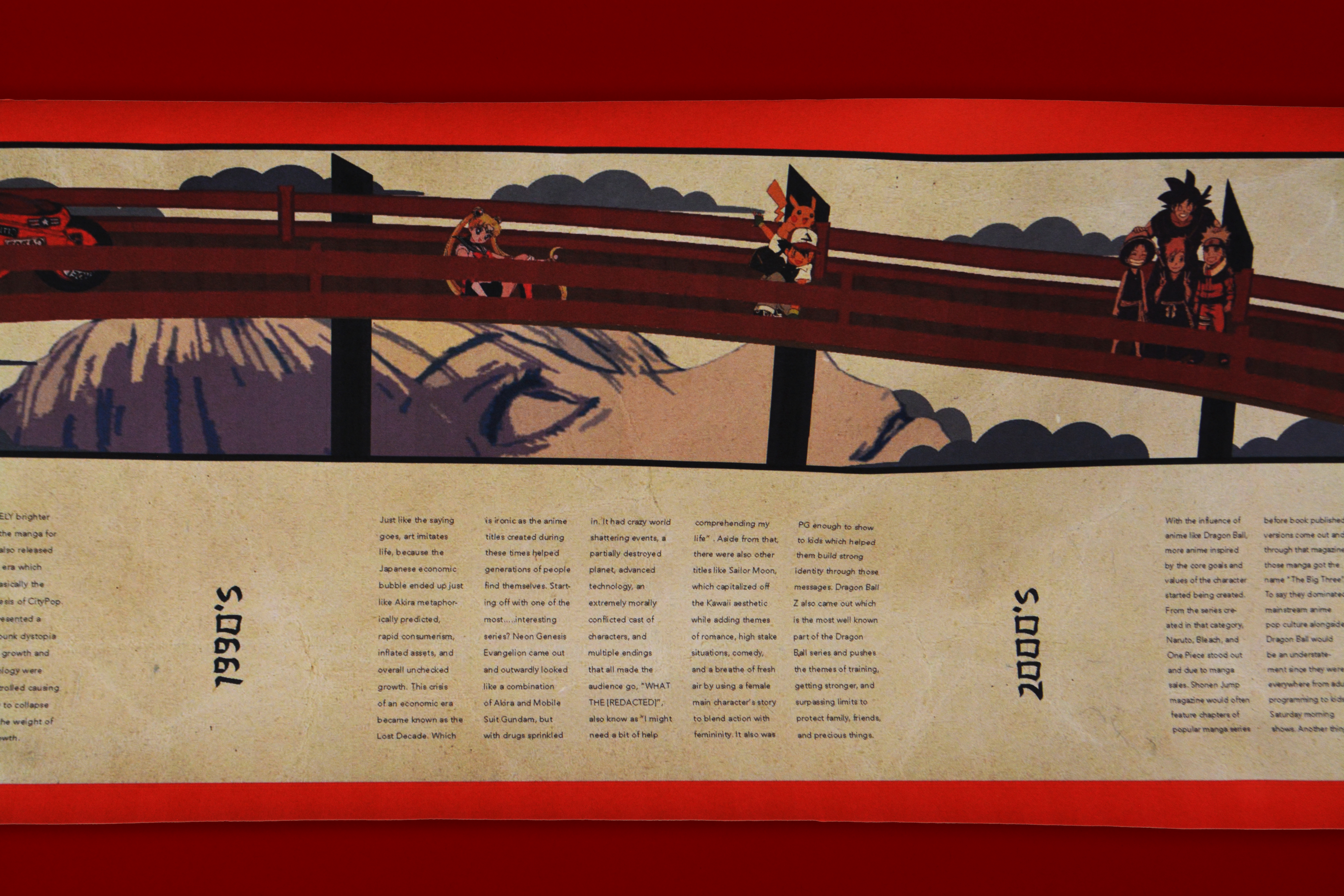
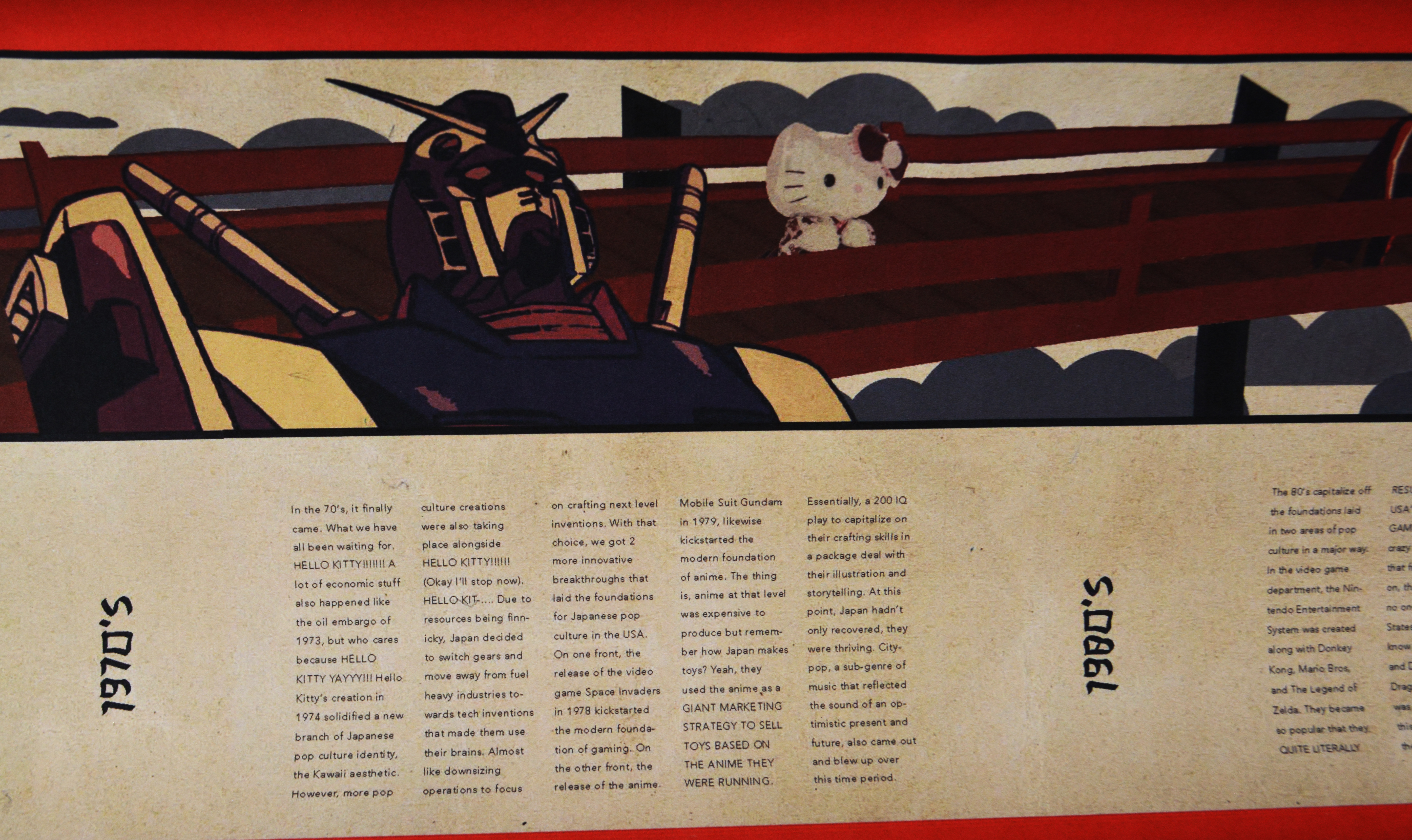
Kakehashi: The Bridge
Size: 12 x 64 inches
This scroll shows a bridge of pop culture between the US and Japan through type, quippy descriptions, and era-based visuals. Each character faces one direction to show that this is a linear timeline, and to display the US is on the receiving end of cultural influence. The form of a scroll was chosen to reference early Japanese book forms and because the horizontal format makes a visual reference to a bridge. The text set up is displayed to imitate the vertical style of Japanese writing.
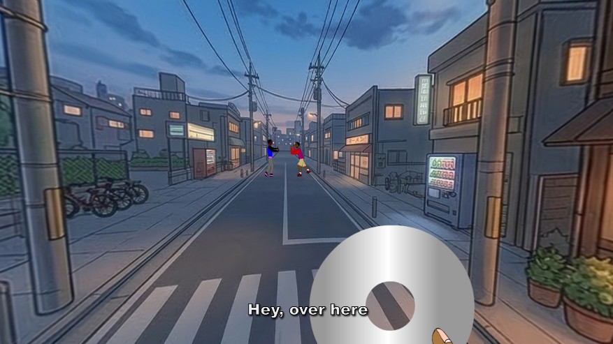
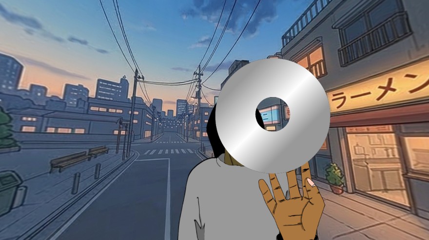
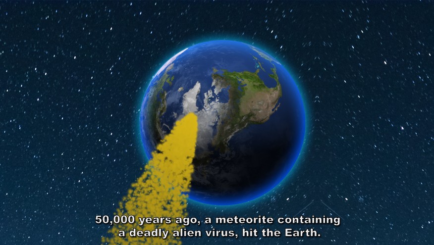
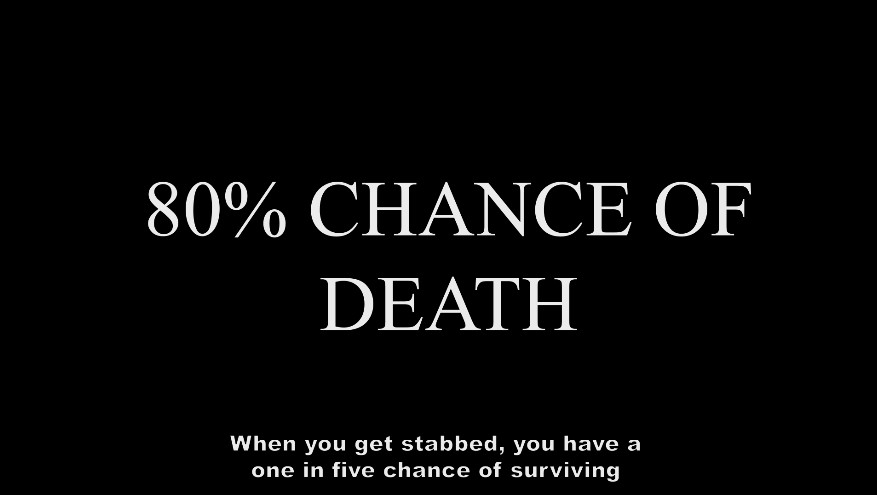
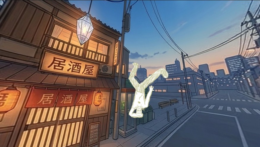
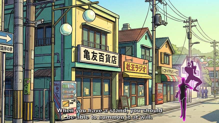
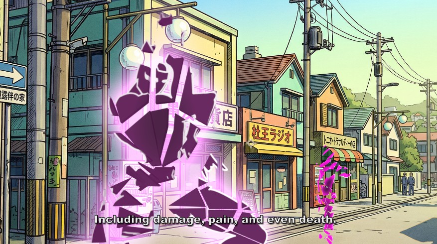
Stand Explainer Video
Size: 1920 x 1080 pixels 2:48 minutes Watch Video
This animation is a conceptual exploration of a narrative "pedagogical moment"—specifically, the introduction and explanation of the "Stand" power system. Utilizing a first-person POV, the viewer is transformed into a bewildered student of a supernatural vernacular. The work seeks to balance high stakes with specific cultural humor: the tension of the brewing conflict (the initial fight) is immediately upended by the visual juxtaposition of the serious explanation against the comedic, "annoying" behavior of the Stand itself. The staccato, frame-specific pacing in After Effects is utilized to mirror the mental overload of the protagonist, prioritizing character dynamic and conceptual goofiness over traditional, fluid realism.
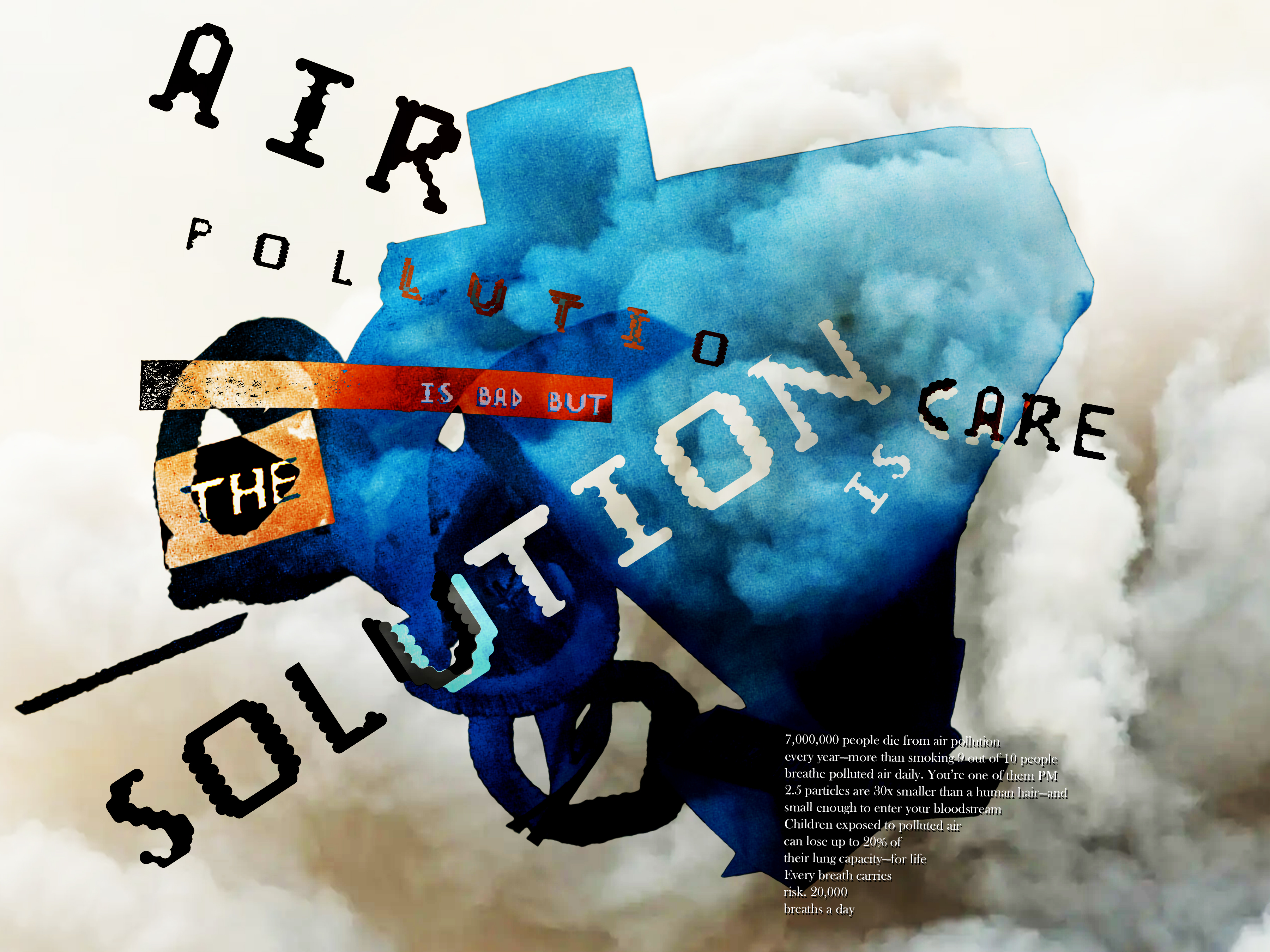
Air Pollution Poster
Size: 24 x 18 inches
This poster explores the idea that the solution to air pollution begins with awareness and personal responsibility. The central message, air pollution is bad but the solution is care, is reinforced through a custom typeface developed from the negative space of clouds, referencing air as both a visual and conceptual element. A silhouetted 3D form, tinted in unnatural blue tones, represents the human presence within polluted environments, while surrounding smoke textures create a sense of atmospheric density and unease. Informational statistics are embedded within the silhouette to connect large-scale data to the individual, emphasizing that air pollution is not distant or abstract, but immediate and personal. By combining experimental typography, environmental symbolism, and factual data, the piece aims to shift the viewer from passive awareness to active concern, framing care not as a feeling, but as a necessary response.
Contact Me
If you'd like to work together, email me at nathanc130@gmail.com